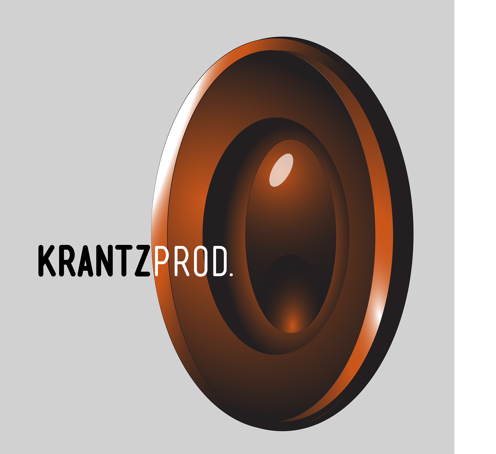
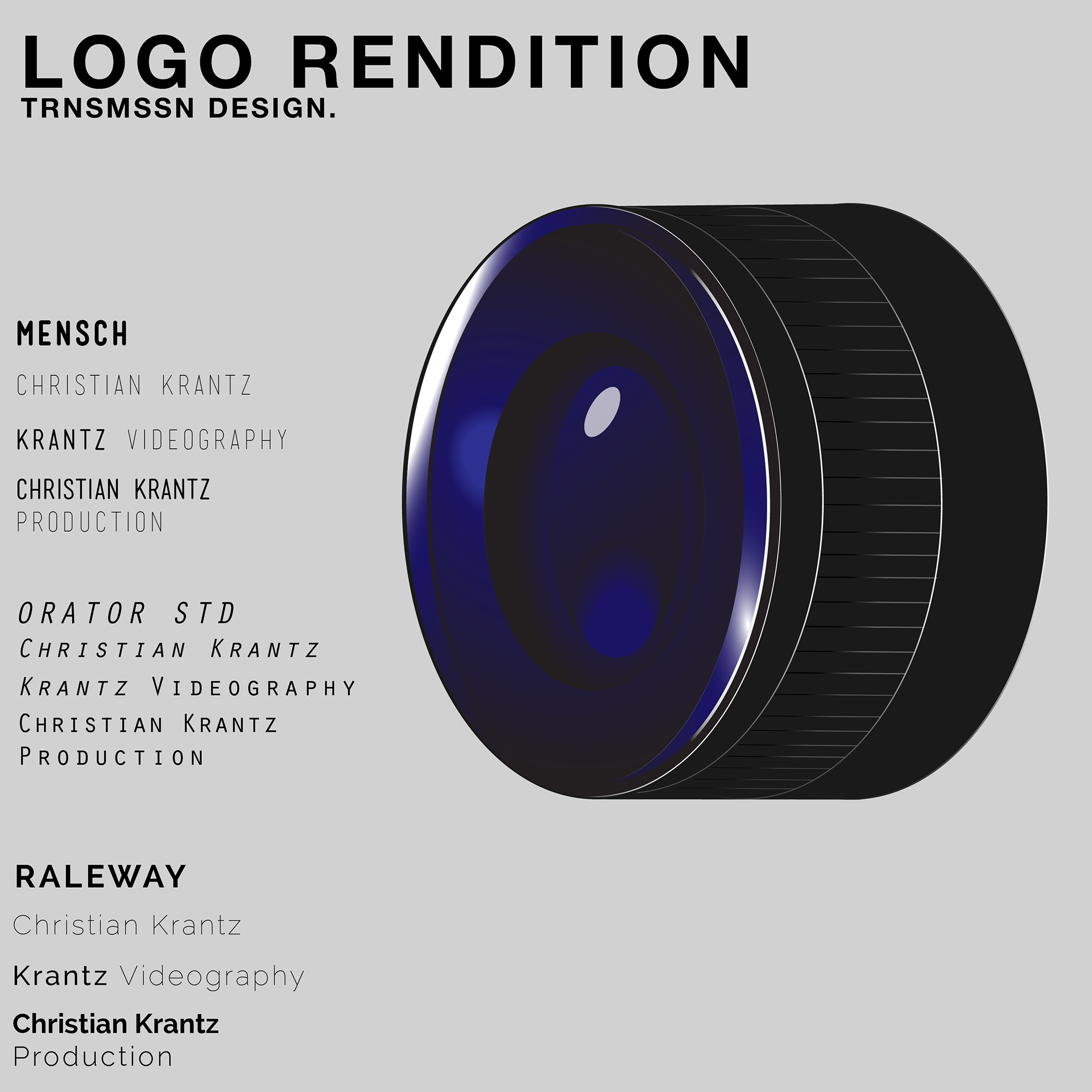
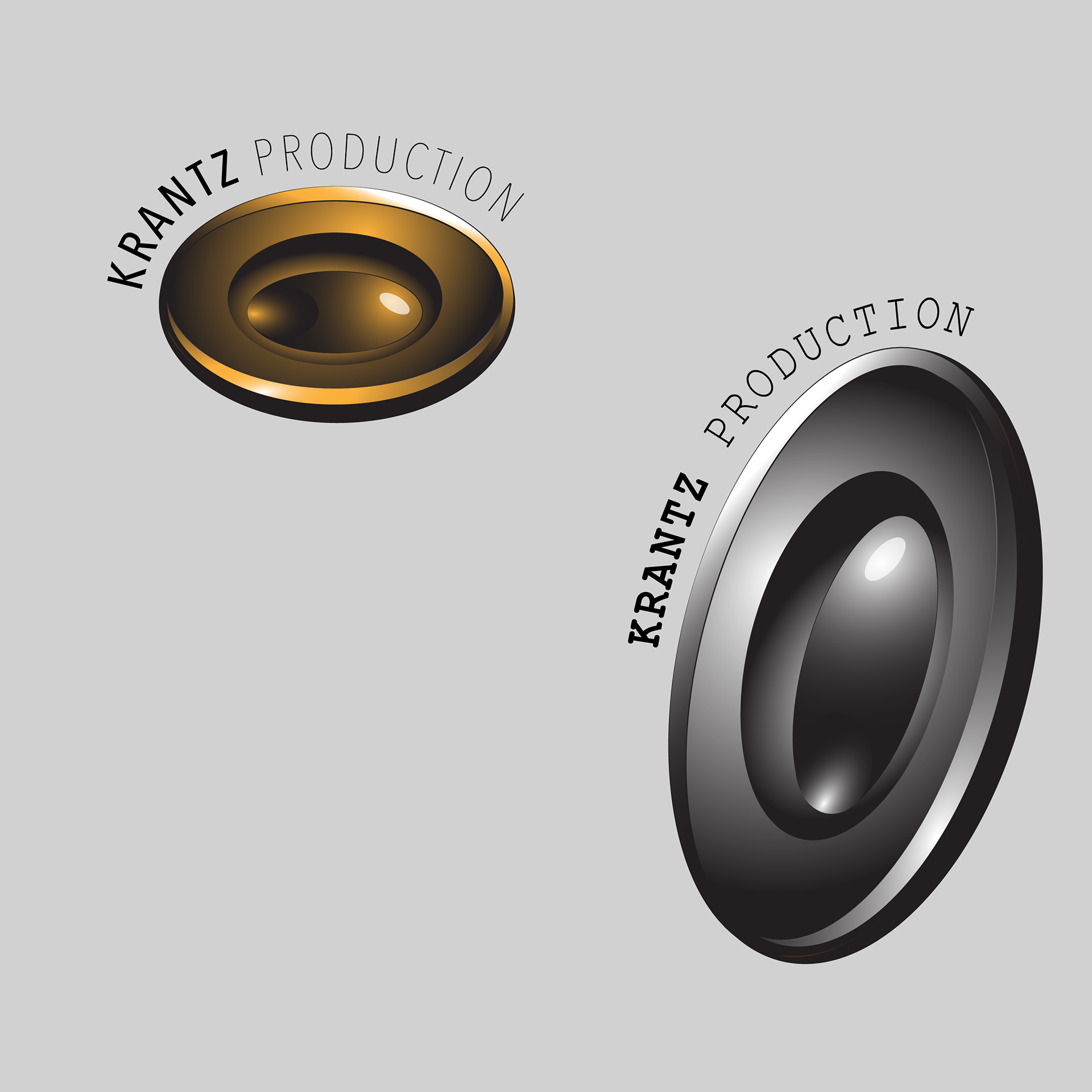
My goal for this logo set was to make a set of sleek, yet recognizable icons which could be easily edited in to any title sequence, and not ruin the effect. the idea of a camera lens/shutter was an easy pick, as it is both a key instrument in the work Christian Krantz does, as well as a beautiful icon which looks best in a minimalistic style and color palette. The Type on the other hand was a little more difficult. We eventually agreed upon the use of Mensch bold.